
Tiles
A tile is one thing from Home Assistant on the screen: a lamp, a thermostat, a sensor, a scene. Its icon, its words and its colours follow Home Assistant, so a tile looks like the same thing does in the Home Assistant app.
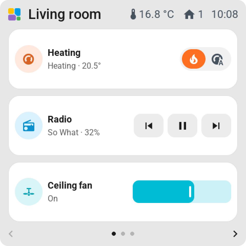
What a tile shows
- The icon. Home Assistant's icon for the entity, including the one you set on it there: an open door, a closed blind, a playing speaker. You can pick another from the icon list.
- The name. Home Assistant's name, or your own.
- The second line. What the screen works out by itself: the brightness of a lamp, the temperature of a thermostat, when a scene last ran. Or nothing, or one attribute, or a text of your own.
- The colour. The state colour Home Assistant uses: amber for a lamp that is on, green for a locked lock, red for an alarm. A lamp with a colour shows its own. Off, closed or away is grey.
Sizes
A tile is Normal (one cell), Double-width, 1 × 2 (two cells tall), 2 × 2 or Full page. Bigger grids allow bigger rectangles, up to a tile that takes most of a 10-inch screen.
Point at a tile in the editor and drag its right edge for the width or its bottom edge for the height. The handles only offer sizes that fit without moving the neighbours. A full-page tile is one big button, with its slider, keys or graph at the bottom.
A tile's settings
Click a tile in the editor and its settings open beside the preview. Every change shows on the preview at once.
| Setting | What it does |
|---|---|
| Name on the screen | Your own name for the tile. Empty means Home Assistant's. |
| Display | How the tile looks: Name and status, Large value, or a face of its own kind, such as a graph for a sensor or the album cover for a player. |
| Second line | Automatic, Nothing, A value (one attribute, written as Home Assistant writes it) or Own text. |
| On tap | Automatic does the obvious thing. Open control opens the card instead. View only does nothing. On / off switches. Perform action runs any action Home Assistant offers for the entity, with its fields. |
| Direct control on the tile | On a tile bigger than one cell: a switch, a slider or keys on the tile itself, so nobody needs the card. Which ones depends on the kind. |
| Small slider on the tile | A thin slider in the tile for brightness, speed, position, volume or a value. |
| Icon | Automatic (from Home Assistant), or one of 150 icons sorted by room and kind. |
| Pastel background | Default, None, or a colour: red, orange, yellow, green, mint, blue, purple, pink or grey. Fixed per tile, whatever the state. In dark mode the same colours go deep, with light text. |
| Page | Moves the tile to another page. |
None as background removes the card: the content sits straight on the page, at the same size.
Tap, hold, confirm
A tap shows the new state at once. Home Assistant confirms it a moment later, or refuses and the tile goes back. Hold a tile for its card. On the screen has the details, and the pages under Tile types say what each kind does.
The same entity can be on several tiles, and on several pages.
Unavailable
A tile greys out and says Unavailable when Home Assistant can't reach its entity, or when the entity was renamed. Choose it again in the editor if the name changed.
Icons
Every icon is a Material Design Icon, the set Home Assistant uses, built into the screen's firmware. A tile follows Home Assistant's icon by default, state included. The list in the editor holds 150 icons in groups: lighting, rooms, climate, weather, media, security, appliances, energy, window coverings, garden and pets, people and travel, and other. Icons outside that list can't be shown; every icon costs memory on the screen.