 tessera
Features Wishlist
Media player tile: a "volume only" direct control, with no name or icon
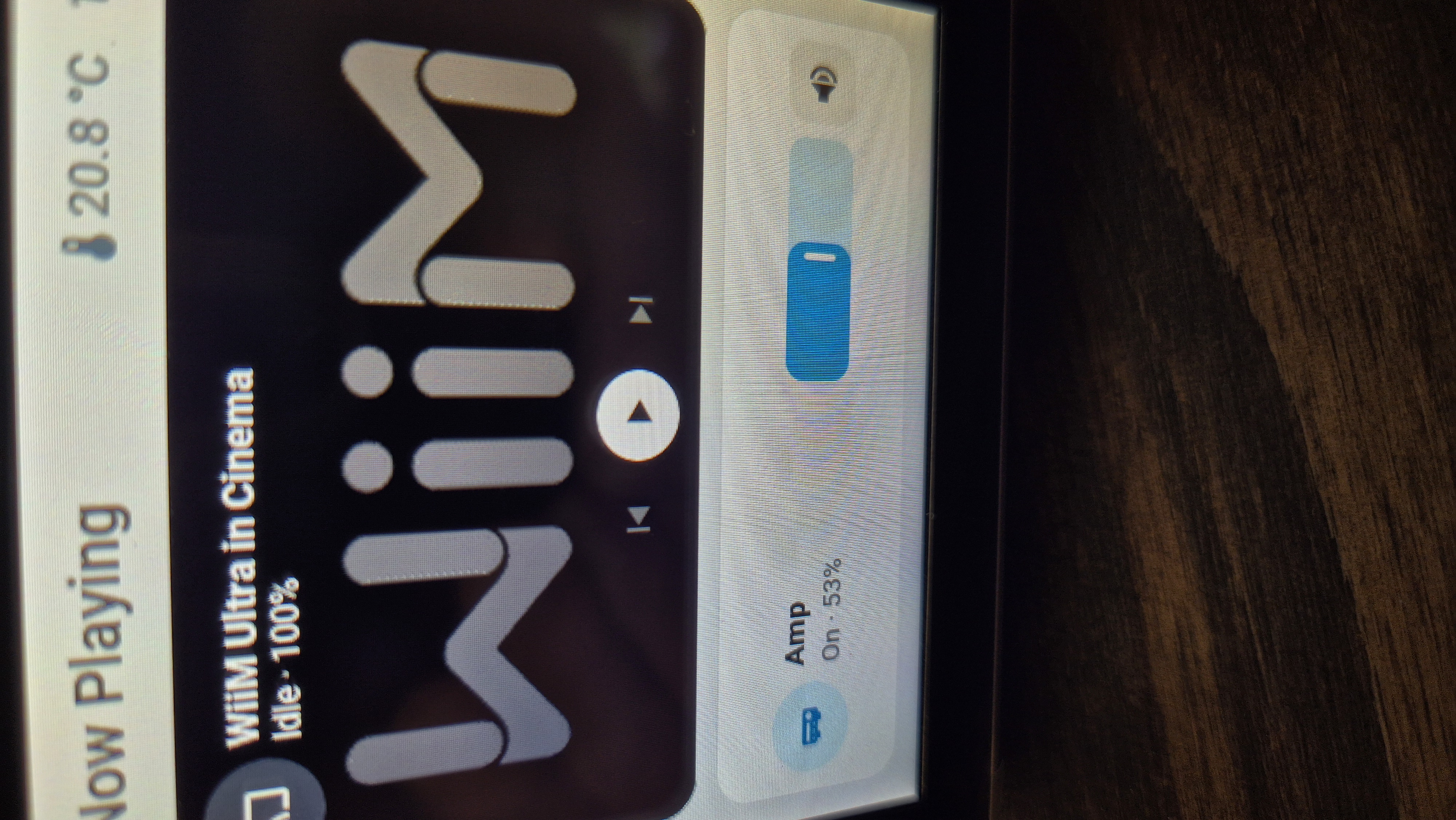
The problem On a double-width media player tile, the volume direct control shows the icon, name and state on the left, then the slider, then the mute button. The slider ends up taking only about a third of the tile's width. On a small screen, or on a panel that is only there to set the volume, that leaves a short slider and a lot of space used for a label. What I'd like An extra choice under Direct control on the tile for media players, for example Volume only, which leaves out the name and icon so the slider and the mute button can use the whole tile. Perhaps the state (53%) could stay as a small value on the slider, or be dropped too. I'm not suggesting any change to the existing volume control, which is fine as it is for a tile in a normal list. This would be a new, optional layout, so existing layouts wouldn't change. Why it's useful Screens that are dedicated volume panels, such as a wall panel in a conference room, a bar or a cinema room, where the tile's name doesn't matter. Small boards, where a slider that fills the tile is much easier to use with a finger. It lets a tile sit next to a media card, as in the screenshot, and look like a proper volume bar. Notes As far as I can see from catalogue/media_player.yaml, controls are declared per entity type (volume needs media_player.volume_set and media_player.volume_mute), so this might be a new control alongside it. I haven't looked at the firmware that draws the tile, so I don't know how much layout work is involved. Please tell me if it would be better as an option on the existing control, such as a "Hide name and icon" switch. Plugins can't do this: they only receive taps, so they can't make a draggable slider. That's why I'm asking here. Happy to test on a Guition 4".
Discussion 0
Add a commentStart the conversation
Share an example, ask a question or explain how you would use this.